Have you noticed that some pages on Forkliftaction.com look a little different? Here’s a quick rundown on what we’ve been up to with our latest website revision…
 Like taming a Rubik's Cube, we've been carefully re-designing and re-organising our home and news pages.
 Like a virtual community board, we pull together the industry content most relevant to your region.
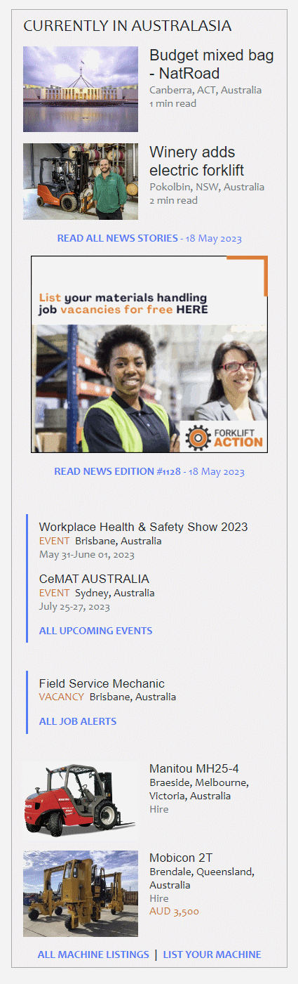
Spotlighting regional content
We know that many of you appreciate Forkliftaction’s ability to deliver a reliable snapshot of what’s happening across the global materials handling market.
But it’s important to us that the website holds equal value and relevance for those of you who tend to a local market as for those with global reach.
When you come to Forkliftaction, we think you should be able to see at a glance all the information that is most relevant to your local market.
For some time now, we’ve been working towards better promoting and delineating this regional information.
First, we created the regional news columns, then we rolled out geo-targeted advertising options across all our formats.
Now we are excited to present you with a highly visible space on our homepage that captures and draws together the latest news, products, job alerts and industry events that are most relevant to your regional market.
Like a community noticeboard, if you will. Bringing together all the company, product, and market developments, job opportunities and trade events from your local industry.
We hope you use this space to share your company news and opportunities with your peers. You can do that here.
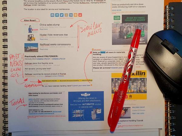
Making the news more accessible (searchable, browsable)
Although we are proud of all the industry content and resources we pull together on Forkliftaction, this plethora of information causes quite the headache when it comes to website design.
We are constantly weighing up ‘How can we create a website that is uncluttered, quick to navigate and nice to browse, while still cramming in all the info we know that our audience is looking for?’
Like taming a virtual Rubik’s Cube, we’ve been carefully re-designing and re-organising our news pages.
We hope we have improved browsing and searching in the archives. That we have reduced unnecessary clutter. That you enjoy quick access to related news items now listed at the bottom of each news story.
We’ve also done some work to make our industry blogs simpler to find and read. We have four different types all with a different emphasis and something unique to offer. They have their own designated corner on the website.
We hope you enjoy browsing these shared experiences and views from people in your industry. And, of course, our ‘Inside-the-news’ blog, your weekly insight into the topics and trends behind the news.
That’s all for now folks. After many weeks of work: mocking-up designs, arguing the benefits of a long list of seemingly small tweaks, testing for problems on our test website, revising what doesn’t work, cursing the website, then apologising to the website, we are there… and the results went live on Tuesday. As usual, we pushed the 'go' button and activated the new design, exhaled a big breath of relief, then looked around and said ‘right what’s next…’
 The initial process is maybe surprisingly low tech. A combination of design in Word and Photoshop as well as a cut and paste of snippets from existing pages.
Such is the life of a website, always changing and adapting, never static for too long.
As usual, watch this space...
If you have feedback or ideas for future developments, reach out to the team!